
Small island, Big Differences - What the averages don't tell you about Singapore

In a country you can drive across in under an hour, why the differences between neighbourhoods still matter.
Every year, the Department of Statistics Singapore quietly releases one of the richest datasets available to the public: the General Household Survey. Buried in its tables are answers to questions that shape national conversations — about wealth, about ageing, about work — questions that are usually discussed in headlines as single, national percentages. “1 in 7 households now earn over $30,000 a month.” “Singapore’s population is ageing.” “Most residents remain in the workforce.”
These are true statements. They are also, in an important sense, incomplete ones.
A national average describes a country that exists nowhere in particular. It flattens Tanglin and Tengah into a single number, even though the two planning areas could not look more different. The moment you reintroduce geography — where people actually live — the same dataset starts telling a very different, much more useful story. Not a story about Singapore in the abstract, but about specific towns, and the specific mix of people who call them home.
A quick note on terms, because precision matters here: the data below is organised by Singapore’s 55 official “planning areas” — the urban planning regions used by URA and SingStat — which are not the same thing as postal codes or postal districts. Each planning area is, in turn, built up from smaller “subzones” (332 of them island-wide). We’ve worked at the planning-area level in this piece because that is where the household income and employment tables are published; the demographic tables (age, race, dwelling type) actually go one level deeper still, to the subzone, for those who want an even sharper picture. That finer lens is a natural candidate for a future instalment in this series.
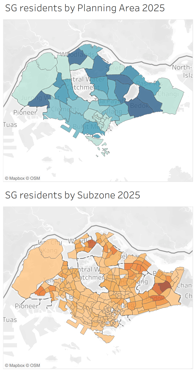
It’s also worth pausing on just how small a canvas this is. Singapore’s entire land area is about 736 square kilometres — roughly the size of New York City — small enough to drive from Changi in the east to Tuas in the west in under an hour. On a canvas that size, you might reasonably expect life to look much the same from one end of the island to the other. The data says otherwise, repeatedly and by a wide margin, as the three insights below show. These are not differences between distant regions of a large country; they are differences between towns a twenty-to-thirty-minute MRT ride apart. That, in a strange way, is what makes them so useful: whatever is driving each gap is local and specific enough to actually do something about.
This is the first in a series of articles we plan to publish drawing on this dataset, each time viewing it through a different lens. We are starting with geography because it is, in many ways, the most intuitive one: everyone understands a map. To make the data explorable rather than just readable, we have also built an interactive dashboard on Tableau Public, which you can explore yourself at the link at the end of this article. What follows are three insights it surfaces — and a case for why looking at data this way changes what you can do with it.
One in Seven households in Singapore have a household market income of over SG$30,000
SingStat’s 2025 survey found that 13.4% of resident households now earn a monthly market income of $30,000 or more — nearly one in seven, and almost double the 7.4% recorded in 2020 (SingStat, Key Household Income Trends 2025). Reported nationally, this is a striking statistic about rising affluence. Broken down by planning area, it becomes something more specific: a map of where that affluence actually sits.

The data shows Tanglin (57% of households above $30,000/month) and Bukit Timah (51%) far out in front of every other planning area, followed by Novena (34%), Marine Parade (25%) and Serangoon (23%). The national figure of “1 in 7” sits closer to 1 in 20 in areas like Woodlands, Yishun and Jurong East — a roughly eightfold spread between the highest and lowest planning areas, inside a country barely 50 kilometres end to end.

What makes this more than a curiosity is what sits alongside it in the same dataset: the share of households living in private property. Tanglin (95%) and Bukit Timah (91%) again lead the nation, with Novena (59%) and Marine Parade (52%) following the identical order. High income and private housing move almost perfectly together, area by area. Neither figure is surprising on its own — private property has always cost more, and higher earners have always been more likely to own it. But seeing the two lines rise and fall together, across every one of Singapore’s planning areas, is a different kind of evidence than being told this in a single sentence. It’s the difference between being informed and being convinced.
Living alone points to two directions at once
There has been growing public concern, echoed by charities and funeral service providers, that more seniors in Singapore are dying alone and unattended in their homes (The Independent Singapore, 19 July 2026, citing local charities reporting funeral-service demand more than doubling over three years). It’s worth being precise about what is and isn’t known here: the Ministry of Health has stated it does not keep an official national count of seniors who pass away alone, so there is no single verified trend line — only directional signals from charities on the ground.
What the Census data can do is show, with more precision than usual, where one-person households are concentrated — which is a meaningful, related, but not identical question. Two different pictures emerge depending on whether you look at proportion or raw numbers.

By proportion, one-person households are most common in Outram (44% of all households), Tengah (35%) and Kallang (25%). But by sheer number of households, the areas with the most people living alone are Bedok (18,700), Yishun (14,400) and Hougang (13,500) — each a large, established town where one-person households are a smaller share of a much bigger population.

This distinction matters for anyone trying to act on the data. A social service agency with limited outreach staff would allocate them very differently depending on which of these two maps it is looking at: proportion points to Outram, Tengah and Kallang as places where a resident is statistically more likely to be living alone; raw numbers point to Bedok, Yishun and Hougang as the places where the largest total population of solo residents actually lives, and where the seniors-among-them share is broadly similar (roughly 21–24% aged 65 and above in Bedok, Kallang and Hougang, a little lower in Yishun at around 17%). Both maps are true. Neither alone is sufficient. This is precisely the kind of nuance that a single national percentage cannot carry, and that a geographic breakdown restores.
Workforce participation is really an age story
The share of residents outside the labour force is, on the surface, one of the more consistent figures across Singapore’s planning areas, generally sitting in the low-to-mid 30% range. But a handful of outliers stand out clearly: Bishan (40%), Bedok (37%) and Bukit Merah (37%) sit well above that band, while Tengah (17%) and Punggol (25%) sit well below it.
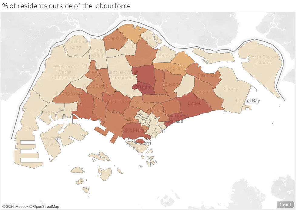
The data offers a fairly clean explanation. Cross-referencing against age profile, the high-outlier areas are also home to some of the largest shares of seniors aged 65 and above — Bukit Merah (25%), Bishan (23%) and Bedok (24%) — while the low-outlier areas are the opposite: Tengah, Singapore’s newest town, has only 7.5% seniors, and Punggol just 10%. Workforce participation, in other words, is very likely an age story wearing a labour-force costume. Knowing this changes the question a policymaker or employer should ask — not “why is workforce participation low in Tengah and Punggol?” but “how do we plan services and infrastructure for towns whose age profile will shift dramatically over the next twenty years?”
Why this matters more than the individual insights
None of these three findings required advanced statistics. Every one of them was sitting in a publicly available government dataset, available to anyone willing to open the spreadsheet. What changed the story was not the data itself, but the decision to look at it through a specific lens — geography — and to let the visualisation do the work of building the case, row by row, area by area, until the pattern became difficult to argue with.
That is the real argument for investing in data and visualisation capability, inside government agencies, nonprofits and businesses alike. A well-chosen chart does not just present a conclusion; it builds consensus, because the audience arrives at the insight themselves, one data point at a time, rather than being asked to take a claim on faith. And in a country as compact as Singapore, that consensus has an unusually practical payoff: a one-size-fits-all national policy will always under-serve some planning areas and over-serve others, simply because it was never designed to notice a 30-minute-wide gap in outcomes. For agencies with finite budgets and finite outreach capacity, the difference between being told where to focus and seeing for yourself where the need is greatest — planning area by planning area, and eventually subzone by subzone — is often the difference between a resourcing decision that gets support and one that stalls in committee.
Getting to that point, though, is a skill in itself. It starts with knowing how to frame the right question of a dataset before you touch it, then finding or building the data that can actually answer that question, then presenting what you find in a form a non-technical audience can absorb at a glance, and finally shaping all of it into a story that is concise, coherent, and compelling enough to move a room. That progression — question, data, visualisation, story — is exactly what FYT's data curricula are built around. If you or your team would find it useful to build that capability in-house, our workshops are a good place to start.
We’d also encourage you to explore the dashboard behind this article yourself, filter by the areas relevant to your own work, and see whether you arrive at the same conclusions we did. That, ultimately, is the point: not to hand you three answers, but to show what becomes possible when the same public data — even data about a country this small — is given a lens, a visual form, and a reason to look closely.
Explore the full interactive dashboard: SG Population Survey 2025 — by Geography
Learn more about FYT's data curricula: FYT Workshops


Comments