
Why Averages Lie — And What They’re Hiding From You
- Nov 6, 2025
- 4 min read
Updated: Nov 7, 2025

Averages lie. And worse — they do it politely.
The average salary. The average wait time.The average rating.
We hear these numbers every day, and they sound reassuring — neat, simple, and definitive. But here’s the uncomfortable truth: the average hides more than it reveals.
The Illusion of Simplicity
Imagine two cafés in Bangkok.
At Café A, everyone waits around 10 minutes for their coffee. At Café B, most customers get theirs in just 3 minutes — except for a few unlucky ones who wait half an hour when the machine breaks down.
Both proudly advertise an average waiting time of 10 minutes.
Would you rather queue at Café A or Café B?
That’s the danger of averages — they flatten the story and make very different realities look identical.

The Hidden Problem With “Average Thinking”
The average — or mean — assumes that everyone’s experience is roughly similar and that outliers don’t matter. But in real life, a few extremes can distort the entire picture.
Take income data, for instance. In many Asian cities — Kuala Lumpur, Jakarta, Taipei — a handful of high earners pull the average skyward, making it sound like everyone is doing better than they really are.
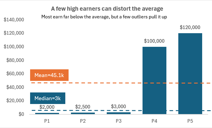
If five people earn $2,000, $2,500, $3,000, $100,000, and $120,000 —
the average income is $45,100
but the median (middle value) is just $3,000.
That’s the real story — a few outliers make the average meaningless for most people.
Seeing Beyond the Average
So how do we uncover what the average hides?By using the right statistic for the right story.
Let’s meet the alternatives.
1. Median — The Middle Truth
The median is the value right in the middle of your data. It tells the typical story, not the extreme one.
Example: Property prices in Taipei: NT$5M, 6M, 6.2M, 60M, 120M
Mean = NT$39.4M
Median = NT$6.2M
Which one better reflects what most people can actually afford?
That’s why governments often report median household income — it’s a better picture of the “middle experience.”
2. Mode — The Popular Choice
Sometimes, the most common value says more than the average.
If you run a café, your average order might be $12.But your mode — the most frequent order — could be the $8 latte that regulars buy every day.
The average suggests you’re a “premium café" The mode tells you what actually drives sales.
3. Range and IQR — The Spread Story
Two sales teams each average $10,000 in monthly revenue. Team A ranges from $9,000–$11,000. Team B ranges from $1,000–$25,000.
Would you treat them the same?
The range and interquartile range (IQR) reveal variability — the stability behind the numbers. The average hides risk; the spread shows predictability.
4. Standard Deviation — The Consistency Check
In manufacturing or finance, the standard deviation tells you how consistent results are around the average.
Two machines both produce screws averaging 10mm. But one varies ±0.1mm, the other ±1mm. The means are identical, yet one machine is far less reliable.
In investments, that same idea measures volatility — because it’s not the average return that hurts investors, but how wildly results swing.
Choosing the Right Lens
Statistic | Best For | Tells You |
Mean (Average) | Balanced data without outliers | Central tendency |
Median | Skewed data | Typical experience |
Mode | Categorical or repeating data | Most frequent behavior |
Range / IQR | Variability | How spread out data is |
Standard Deviation | Consistency / Risk | Reliability and volatility |
When Averages Create Blind Spots
Averages become dangerous when they’re used to simplify what needs to be understood.
Customer Satisfaction: A hotel’s average rating is 4.3 stars. But half the guests gave 5 stars, half gave 3. The “average” masks a polarized experience.
Education: A school celebrates an average math score of 75%. But half the class scored below 50%. The “average” hides a problem.
Workplace Performance: A regional HR team used average performance scores to allocate bonuses. Everyone seemed “average” — until they realized high performers were pulling the mean up. When they looked at medians instead, they saw who was really excelling.
The average comforts. But it can also conceal.
How to Tell the Full Story
If you want to communicate data responsibly — whether in a meeting, a dashboard, or a LinkedIn post — here are three habits worth keeping:
Show the spread, not just the center. Add the median, range, or standard deviation. Context turns numbers into truth.
Match the measure to the message. Use the statistic that fits your data’s shape — not your convenience.
Ask: “What is this number not telling me? "Behind every average lies a more interesting story waiting to be uncovered.

The Real Job of Data Storytelling
As someone who’s seen hundreds of dashboards, I’ve noticed one thing: People love single numbers. They look clean, decisive, and powerful.
But simplification isn’t clarity.
The average comforts us; the truth challenges us.
In data storytelling — and in decision-making — your job isn’t to compress complexity into one number. It’s to reveal the real story behind it.
Final Reflection
So next time someone quotes an average — a salary, a rating, a result — pause for a moment and ask:
“Is this the real story, or just the easy one?”
Because great decisions don’t come from easy numbers. They come from curious minds willing to look deeper.


Comments