
Your Dashboard Isn’t Confusing Because of the Data
- Dec 21, 2025
- 4 min read
(It’s Confusing Because of How We See)

I’ve sat through many presentations where the explanation starts like this:
“Let me walk you through this dashboard.”
Ten minutes later, people are still lost.
Not because the data is wrong. Not because the metrics are unfamiliar.
But because the dashboard doesn’t organise itself in a way the brain expects.
Before anyone reads numbers, we all ask the same silent questions:
What belongs together?
What should I look at first?
What matters more than the rest?
Those questions are answered — or left unanswered — before logic ever kicks in.
This is where Gestalt principles quietly decide whether your message lands or struggles.
We Don’t Read Dashboards. We Scan Them.
Most dashboards aren’t read carefully.
They’re scanned:
in meetings
between emails
under time pressure
Within seconds, people form an impression:
“This makes sense." or "This feels messy.”
That reaction happens long before anyone checks a legend or studies a chart.
Gestalt principles explain why.
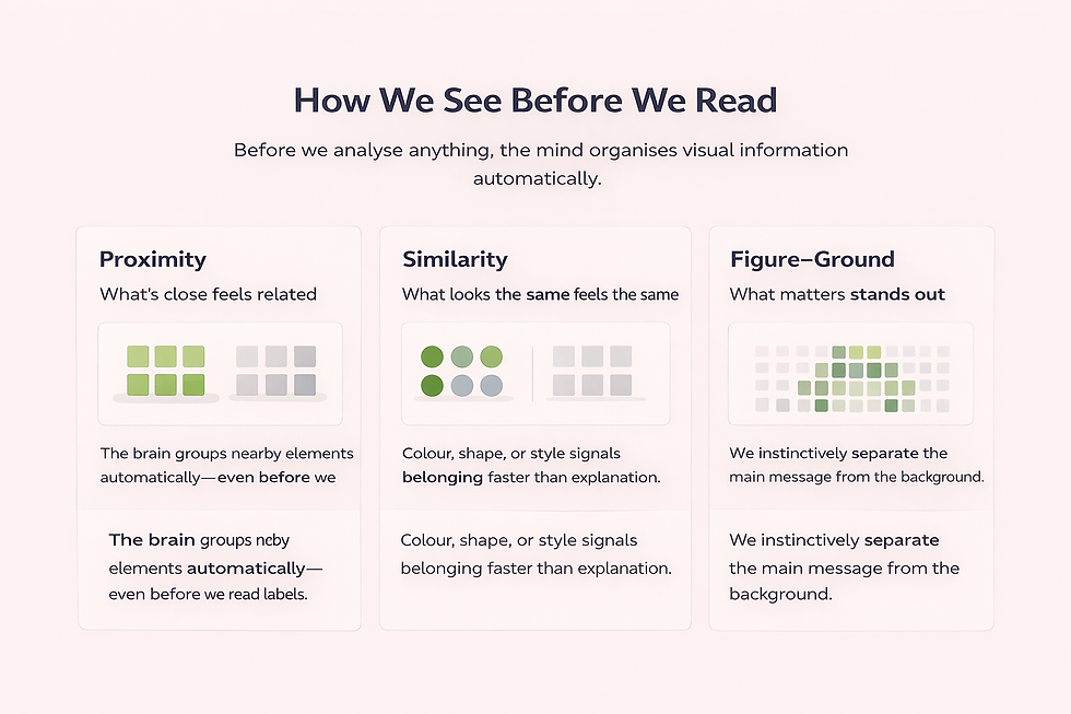
They describe how the human brain automatically organises visual information — grouping, separating, and prioritising — not because we’re analytical, but because that’s how perception works.
A Quick Note on Gestalt
The ideas behind Gestalt aren’t new.
They come from early 20th-century psychology, where researchers tried to understand how humans perceive the world. Their core insight was simple but powerful:
We don’t experience things as isolated parts — we perceive organised wholes.
In other words, the brain doesn’t wait for logic. It groups, separates, and prioritises information automatically, often before we’re aware it’s happening.
Over time, these ideas found their way into design, architecture, and visual communication. But they were never really about aesthetics.
They were about how perception works.
Whether we’re looking at shapes on a page or metrics on a dashboard, the same perceptual rules apply. That’s why charts can feel intuitive or confusing long before we read a single label — because our brains are already organising what we see.
The Brain Wants Structure Before Meaning
One of the most important ideas behind Gestalt is this:
The brain looks for structure before it looks for meaning.
It tries to answer:
what’s related
what’s separate
what stands out
And it does this whether you planned for it or not.
That’s why two dashboards with the same data can feel completely different.

Seeing the Same KPIs Differently


Consider two layouts showing the same four business KPIs — Revenue, Cost, Profit, and Customer Satisfaction.
The charts are identical. The values haven’t changed. Nothing new has been added.
Only the placement is different.
In the first layout, the KPIs are spread out evenly across the page. Nothing is technically wrong — but everything competes for attention.
Revenue sits apart from Cost. Profit feels disconnected from both. Customer Satisfaction floats nearby, without context.
You can read the numbers — but it’s hard to tell what belongs together, or where your attention should go first.
In the second layout, the same KPIs are simply arranged differently.
Revenue, Cost, and Profit are placed closer together. Customer Satisfaction is given its own space.
Almost immediately, groups begin to form. A structure appears — without labels being read or values being emphasised.
Nothing “clever” was added.The difference comes purely from how the information is arranged.
This is Gestalt at work — principles like proximity, common region, and figure–ground shaping understanding before a single number is consciously analysed.
Why Grouping Changes Understanding
Our brains are constantly looking for structure.
When related items sit close together, we assume they belong together.When they’re separated, we assume they don’t.
Simple choices — spacing, alignment, and light visual boundaries — quietly tell the reader:
“These numbers describe the same story.”“This metric answers a different question.”
In the grouped layout, financial performance explains itself. Customer satisfaction stands apart — not because it’s less important, but because it represents a different dimension of the business.
Good grouping doesn’t need explanation. It reduces the need for explanation.
When Everything Looks Important, Nothing Is
Another problem many dashboards suffer from is visual competition.
Heavy borders.Strong gridlines.Multiple charts all demanding attention.
When everything is emphasised:
nothing feels important
hierarchy disappears
the viewer gets tired quickly
Good dashboards don’t shout.
They let key numbers lead.They push supporting information into the background.They create a clear separation between signal and noise.
This distinction — between what matters most and what provides context — is another quiet Gestalt effect.
When grouping and hierarchy work together, the dashboard doesn’t need to be explained.
It explains itself.
Why This Matters More Today
In the past, dashboards were often:
static
printed
reviewed slowly
Today, they’re:
live
glanced at
used to justify fast decisions
People don’t have time to “figure out” your layout.
When structure is unclear, meetings drift into interpretation instead of decision — and the data quietly loses its influence.
And once people stop trusting what a dashboard seems to say, no amount of explanation will bring that trust back.
This Isn’t About Design Taste
Gestalt principles aren’t about making things pretty.
They’re about:
reducing friction
guiding attention
helping people make sense of information quickly
You don’t need to become a designer.
You just need to recognise that layout communicates before numbers do.
Once you see this, you’ll start noticing why certain dashboards feel intuitive — and others feel exhausting.
The Real Cost of Ignoring Perception
When dashboards fail, we often blame:
the audience
their data literacy
their attention span
But more often, the issue is simpler.
We forgot that people see before they think.
Gestalt principles remind us that perception sets the stage for understanding — not the other way around.
A Final Thought
The most effective dashboards don’t need defending.
They feel obvious. They guide the eye naturally. They make the message hard to miss.
Gestalt principles won’t change your data.
They’ll change whether your data is understood.
And in a world overloaded with information, that difference matters more than ever.
If Gestalt explains why structure matters, the next question becomes unavoidable:
What visual properties actually carry the data?
That’s where visual cues come in — and that’s what the next article will explore.


Comments