
Your KPI Doesn’t Mean What You Think It Means
- Mar 29
- 4 min read
Part 2 of a Series: From Messy Problems to Clear Definitions

Why This Matters More Than You Realise
In the previous article, we explored a common issue in analytics work. Most problems do not start clear. They start messy, and without proper structure, teams often move too quickly into analysis without fully understanding what they are trying to solve.
That is where things begin to break down.
But even when teams attempt to be more structured, another challenge appears almost immediately.
Most teams don’t struggle with a lack of data.They struggle with knowing what their numbers actually mean.
And that is where the next layer of confusion begins.
When a KPI Isn’t Enough
Take a common example: “Sales are down.”
At first glance, this looks like a useful KPI. It is measurable, trackable, and easy to communicate across teams. But on its own, it tells you very little. That is because “sales” is not a single thing. It is the result of multiple factors working together, and without understanding those factors, the number raises more questions than answers.
Which product is affected?
Which customer segment is changing?
Which channel is driving the decline?
Over what time period is this happening?
And more importantly, what decision are we trying to support?
Until these questions are addressed, the KPI does not define a problem. It only signals that something might be wrong.
The Hidden Problem with Most KPIs
Most KPIs are aggregated by design. They compress multiple dimensions into a single number, which makes them useful for reporting but far less useful for understanding.
Aggregation is useful for reporting. But it’s one of the fastest ways to lose the problem.
It hides detail, removes context, and makes it harder to see where the real issue lies.
When a KPI changes, it is rarely because everything changed equally. More often, the shift is coming from a specific product, a particular customer segment, or a single channel. But when everything is rolled into one number, that signal gets buried.
As a result, teams often respond by analysing everything. And when everything is analysed, nothing becomes clear.
A single number hides multiple drivers. Until you break it down, you don’t know where to look.
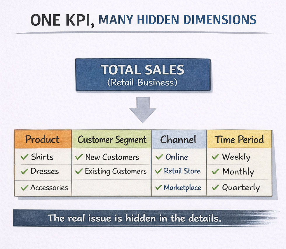
Introducing the KPI Dimension Map
This is where most teams get stuck. And this is where the KPI Dimension Map becomes useful.
It is not a complex model, but a simple way of thinking. Instead of treating a KPI as a single number, you deliberately break it down across the dimensions that define it.
These dimensions will vary depending on context, but in many cases they include product, customer, channel, and time. By mapping a KPI across these dimensions, you move from a single number to a structured view of what that number is made up of.
This shift is subtle, but important.
It turns a KPI from something you monitor into something you can actually investigate.
How It Works in Practice
Let’s return to the earlier example.
“Sales are down.”
Using a KPI Dimension Map, you begin by breaking that number into meaningful components. You look at sales by product, by customer segment, by channel, and across time. As you do this, patterns start to emerge.
Instead of a broad and unfocused problem, the issue begins to localise.
You might find that the decline is not across all sales but concentrated in a specific area.
For example, sales from new customers for Shirts through online channels may have declined over the past three months.
At this point, something important happens.
You are no longer analysing data. You are analysing a clearly defined problem.
And that changes everything.

Clarity comes from breaking the number apart. The issue is rarely across everything.
Why This Changes the Way You Analyse
Once a KPI is broken into its dimensions, the way you approach analysis begins to shift. You are no longer trying to understand a broad number. Instead, you are trying to locate where change is happening.
That shift may seem small, but it has a significant impact. It reduces unnecessary analysis, removes noise, and focuses attention on what actually matters.
Instead of asking, “What is happening to sales?”, you begin to ask, “Where exactly is the change happening?”
And that is a far more useful question.
A Common Mistake to Avoid
A common mistake is to start slicing data without structure. This feels like exploration, but quickly turns into guesswork.
Without a clear way to break down the KPI, analysis becomes reactive. You filter, pivot, and explore, but without direction, it is difficult to know whether you are getting closer to the answer or simply moving around the data.
The KPI Dimension Map provides that direction. It ensures that your analysis is guided by structure, rather than driven by curiosity alone.
Connecting Back to the Bigger Picture
In the previous article, we introduced a simple flow:

The KPI Dimension Map operates within that transition from structured thinking to clear problem definition. It helps take a high-level metric and turn it into a clearly defined problem worth analysing.
Without this step, teams risk analysing symptoms instead of causes.
Where This Doesn’t Go Far Enough
It is important to recognise what this framework does and does not do.
The KPI Dimension Map helps you identify where the problem is. It does not explain why it is happening.
And that distinction matters.
Because moving too quickly into “why” without first understanding “where” often leads to assumptions rather than insights.
Where We Go Next
Breaking down a KPI helps you locate the problem. But many real-world challenges are not just about metrics. They are about how users move through a process or journey.
In the next article, we will look at Pirate Metrics (AARRR), and how it helps identify where performance breaks across the customer lifecycle.
Closing Thought
A KPI tells you something changed. Clarity tells you where to look.


Comments