
The Most Wasted Space in Data Visualization: Chart Title
- Oct 1, 2025
- 4 min read

The Meeting Moment We’ve All Lived Through
You’re in a meeting. A chart flashes on the screen. The title says: “Revenue by Region.”
Silence.
Some people study the tallest bar. Others squint at the smallest. A few trace the trend across regions, trying to decide what matters. And then it comes — that question we’ve all heard before:
“So… what’s the point?”
That pause is the cost of a wasted title.
Titles Are Prime Space
The title of your chart isn’t decoration. It’s prime space. It’s the very first thing your audience reads — the headline that frames everything that comes after.
Yet most titles don’t pull their weight. They repeat what the axes already tell us. “Sales vs. Time.” “Customer Churn Rate.” “Revenue by Region.”
These aren’t headlines. They’re labels. And labels don’t tell stories.
When you only label, you leave your audience to figure it out on their own. And that’s risky — because when people have to search for meaning, they often don’t agree on what they find.
Example 1: Sales Over Time
Let’s start with sales.
📊 Before A chart titled “Sales vs. Time.” Four quarters lined up, bars in neat order. You look at it and think: should I focus on Q4’s strong finish? Or maybe the dip in Q3? The rise in Q2? Everyone in the room is guessing — and everyone’s guess is different.
📊 After Now picture the same chart, but the title reads: “Sales Doubled in Q2—Driven by New Product Launch.” The Q2 bar pops out in bold red, with a small annotation pointing to the launch.
No more guessing. Everyone sees the same story: Q2 is the turning point.
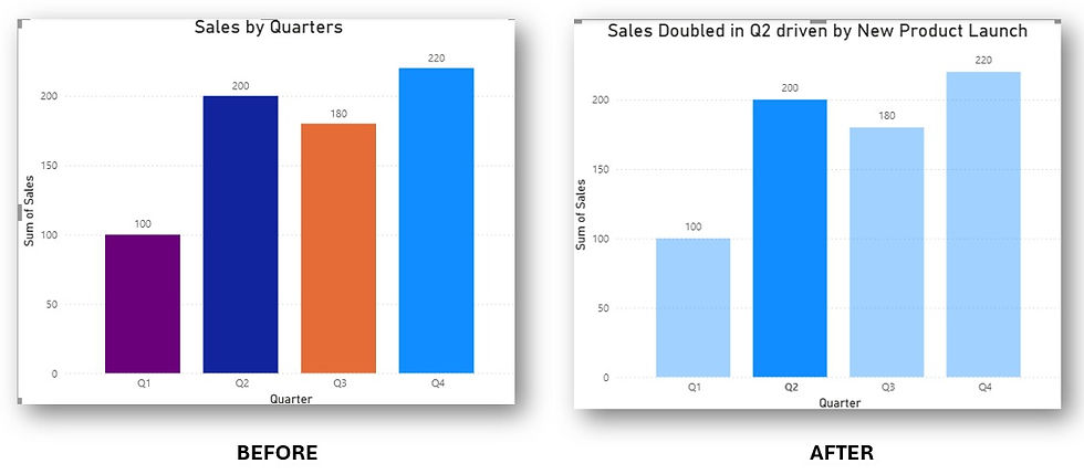
This is what happens when you give your audience direction instead of leaving them to wander. A title frames the story, while a highlight reinforces it. Together, they don’t just present data — they focus attention.
If titles can stop a guessing game in sales, what happens when you’re comparing entire markets?
Example 2: Revenue by Region
Here’s a regional example.
📊 BeforeThe title says “Revenue by Region.” Four bars: Asia, Europe, North America, Latin America. Asia clearly leads, but the title doesn’t tell us that matters. Some people will latch onto Europe’s decline, others onto Asia’s height, and suddenly the discussion splinters.
📊 AfterNow the title reads: “Asia Surges Ahead as Top Revenue Region.” The Asia bar is bold, the others muted. A small note clarifies the growth percentage.
This time, everyone is on the same page: the story is Asia’s rise.
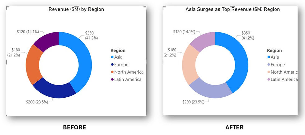
This is where psychology steps in. Our brains are constantly asking: what’s the focus? Without guidance, the audience decides for themselves — and not always in ways that help your story. A strong title answers that question upfront.
If titles can spotlight leaders, they can also frame milestones.
Example 3: Customer Churn
Consider churn.
📊 BeforeThe title: “Customer Churn Rate.” A line slopes gently downward. The numbers look promising, but the milestone — churn finally dipping below 5% — is lost in the detail.
📊 AfterNow the title says: “Churn Falls Below 5% for the First Time.” The line is annotated at the breakthrough point. In a single glance, the audience sees the milestone.
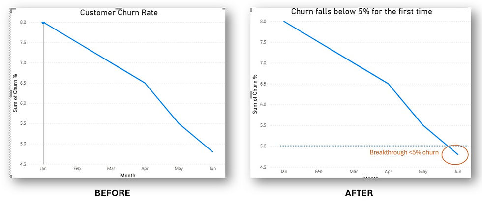
And notice the emotional difference. In the first chart, churn is just a line on a graph. In the second, it’s an achievement. It’s something to celebrate. The title turned data into a story worth remembering.
Why This Works: The Psychology of Titles
So why does a strong title change the way we see a chart? It comes down to how our brains are wired.
First, we’re always looking for shortcuts. When a chart appears, we don’t scan every detail first — we look at the title, searching for a clue. A vague title forces effort; a clear one reduces it.
Second, our eyes notice contrast instantly. Changes in color, shape, or size pop before conscious thought. That’s why a red bar or an annotation is so powerful — the brain can’t help but see it.
Finally, we ask: what’s the focus here? In other words, what’s figure and what’s background? A strong title settles that question. It declares what matters most, while everything else becomes context.
Put these together, and you see why titles are so powerful. They don’t just label a chart — they shape how people see it.
The Mistakes I See All the Time
One mistake I see often is repetition. A chart that says “Sales vs. Time” just echoes what the axes already told us. That’s wasted space.
Another trap is vagueness: “Performance Metrics.” It sounds official but communicates nothing.
Then there’s the overstuffed title — “Quarterly Sales Figures for All Global Regions Over the Last Decade.” Yes, it’s technically accurate. No, it’s not helpful.
And finally, spin. Titles like “Amazing Sales Growth That Proves Our Strategy Works!!!” don’t add credibility; they undermine it.
As Edward Tufte, the pioneer of modern data visualization, reminds us: every element on a chart should earn its place. A title that just repeats the axes wastes space. A title that tells the story makes that space work harder.
Why Titles Shape Decisions
Here’s the deeper point: titles don’t just help with clarity. They shape the conversation that follows.
A chart titled “Revenue by Region” invites debate: “Which region should we care about?”
A chart titled “Asia Surges Ahead as Top Revenue Region” sparks action: “How do we keep the lead in Asia?”
The difference isn’t just comprehension. It’s direction. The way you frame your title influences the way your audience frames their decisions.
So, What Should You Do?
The next time you create a chart, pause before you type the title. Ask yourself:
👉 If my audience remembers only one thing from this chart, what should it be?
That’s your title. Then check that the chart itself reinforces it — highlight the right bar, annotate the key point, mute the distractions.
When your chart and your title work together, you don’t just show data. You tell a story.
Closing Reflection
At your next meeting, watch closely. You’ll see plenty of charts. If the title is just a label, notice how long it takes before someone asks, “So what’s the point?”
Now imagine if the title carried the story instead. How much faster would the message land? How much sharper would the discussion become?
Because when your title tells the story, your chart doesn’t just display numbers.It drives understanding — and action.
The title of a chart is prime space. Don’t waste it.


Comments